RAW Interactive
RAW Interactive are a leading 3D product visualisation and E-Commerce specialist - we supported their brand development and web design.
Even The Experts Require Branding
RAW Interactive are experts in 3d modelling, 3D configuration and E-Commerce. They asked THAT Branding Company to develop their new corporate style.
RAW Interactive are a specialist digital agency that focuses on 3D modelling, E-commerce and merging these technologies to produce interactive product experiences. They also provide supporting interactive services such as video production and animation. As experts in the field, they asked us to develop a new brand and identity, including web design. The design makes use of their expertise, showcasing their talents right throughout the site.
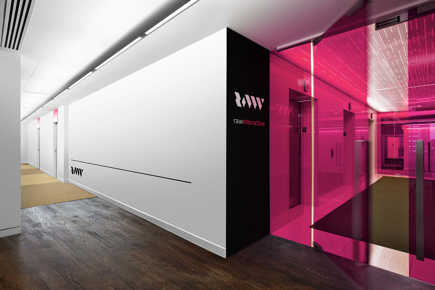
RAW Interactive are very sharp on their design services and the logo reflects this with angular, precise corners. The logo mark works in all lockups including vertical and horizontal. The Black and White transparency of the agency is reflected in the colour scheme, with flashes of colour to compliment, representing their flair brought to each client project.
When you are designing for a digital agency, you need to make sure the site works beyond perfect. We use Adobe XD to create a working mockup of the site where each menu items links to other pages and back again - this gives the client the best feeling for how the site will "look and feel" and enable us to make adjustments on the fly. It also enables us to do this anywhere in the world - signed off, we build. The site also makes much use of RAW Interactive's client work such as the Photography from the legendary "Formula 1 Photographer", Darren Heath. The sit also displays working versions of the 3D modelling and configurations that RAW Interactive have built over the years.
The minimalist and high contrast look continues with the corporate stationery.
Future work for RAW Interactive will involve creation of their own app so we had to be sure the design worked with that. We also designed a simple but stunning custom splash screen for the mobile landing page - full bleed image linked to corporate colour scheme plus simple use of logo and brand. We were particularly pleased with the rotational symmetry that comes with the R mark on its own.


